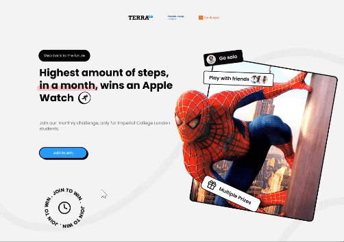
Terra step challenge
My role / tasks
The entire redesign of the site, including research and iterations
Duration
1 Month
Team
1 Designer / 2 Developers
Terra step challenge
My role / tasks
The entire redesign of the site, including research and iterations
Duration
1 Month
Team
1 Designer / 2 Developers
Terra step challenge
My role / tasks
The entire redesign of the site, including research and iterations
Duration
1 Month
Team
1 Designer / 2 Developers
Context
Context
Terra API holds annual step challenges for university students, this year our task is to revamp the site for this year's step challenge for Imperial, MIT and Harvard students.
Terra API holds annual step challenges for university students, this year our task is to revamp the site for this year's step challenge for Imperial, MIT and Harvard students.
Problem
Problem
How might we encourage participation regardless when they join the challenge?
How might we encourage participation regardless when they join the challenge?
We looked through previous emails from pariticipants and having a meeting with previous organisers, we found:
We looked through previous emails from pariticipants and having a meeting with previous organisers, we found:
✳ The challenge was accessible to everyone
✳ Limited referrals and steps per day stopped people from spamming
✳ People signing up halfway will feel discouraged when seeing high scores
Positives
✳ The challenge was accessible to everyone
✳ Limited referrals and steps per day stopped people from spamming
Ideation
Ideation
Brainstorming session to generate potential solutions for our identified problem.
Brainstorming session to generate potential solutions for our identified problem.
Due to time constraints, we had to factor in the feasibility of implementation, ruling out overly complex ideas that could not be executed within the given timeframe.
Due to time constraints, we had to factor in the feasibility of implementation, ruling out overly complex ideas that could not be executed within the given timeframe.


Solution
Solution
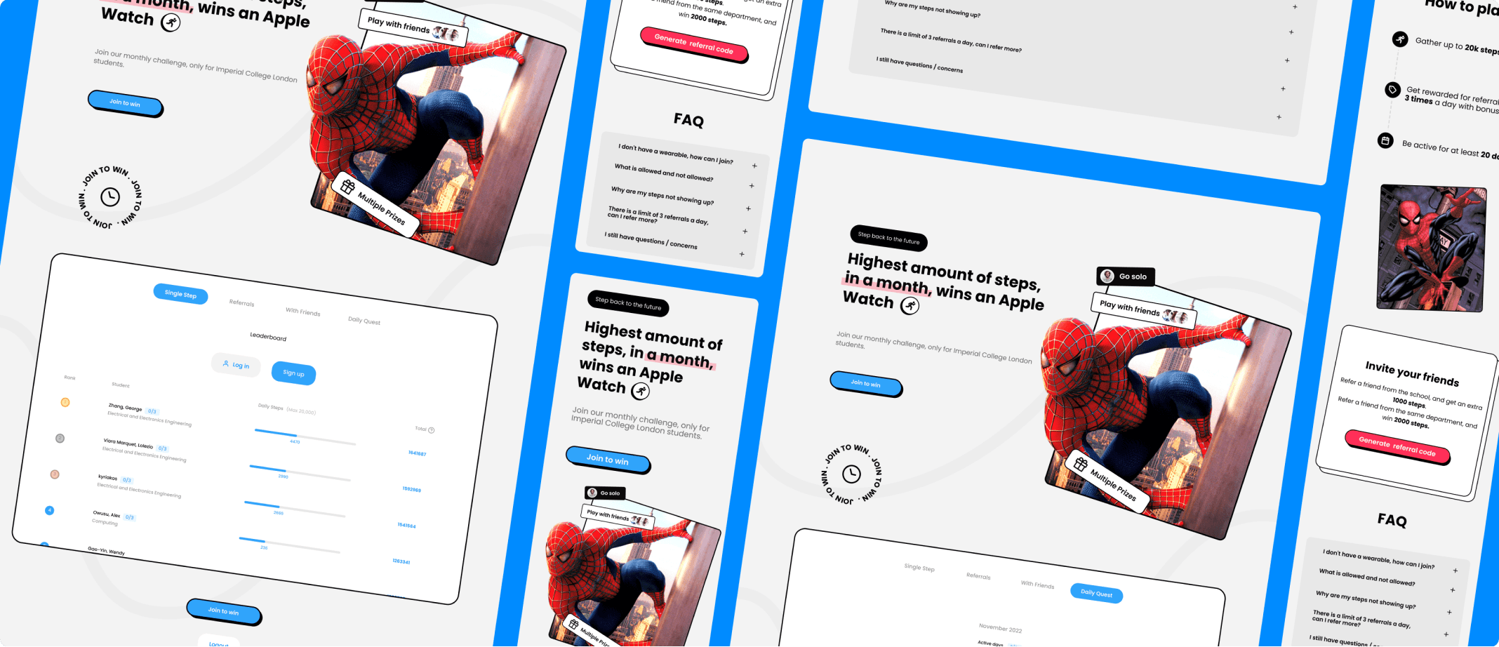
Introducing Daily quests!
Introducing Daily quests!
We decided to give users additional challenges, such as daily quests. By doing this participants will have a higher likelihood of winning something regardless of when they join.
We decided to give users additional challenges, such as daily quests. By doing this participants will have a higher likelihood of winning something regardless of when they join.
✳ Small improvements can often create the most meaningful impact…
✳ Small improvements can often create the most meaningful impact…
Minimise content can prevent cognitive load
Minimise content can prevent cognitive load
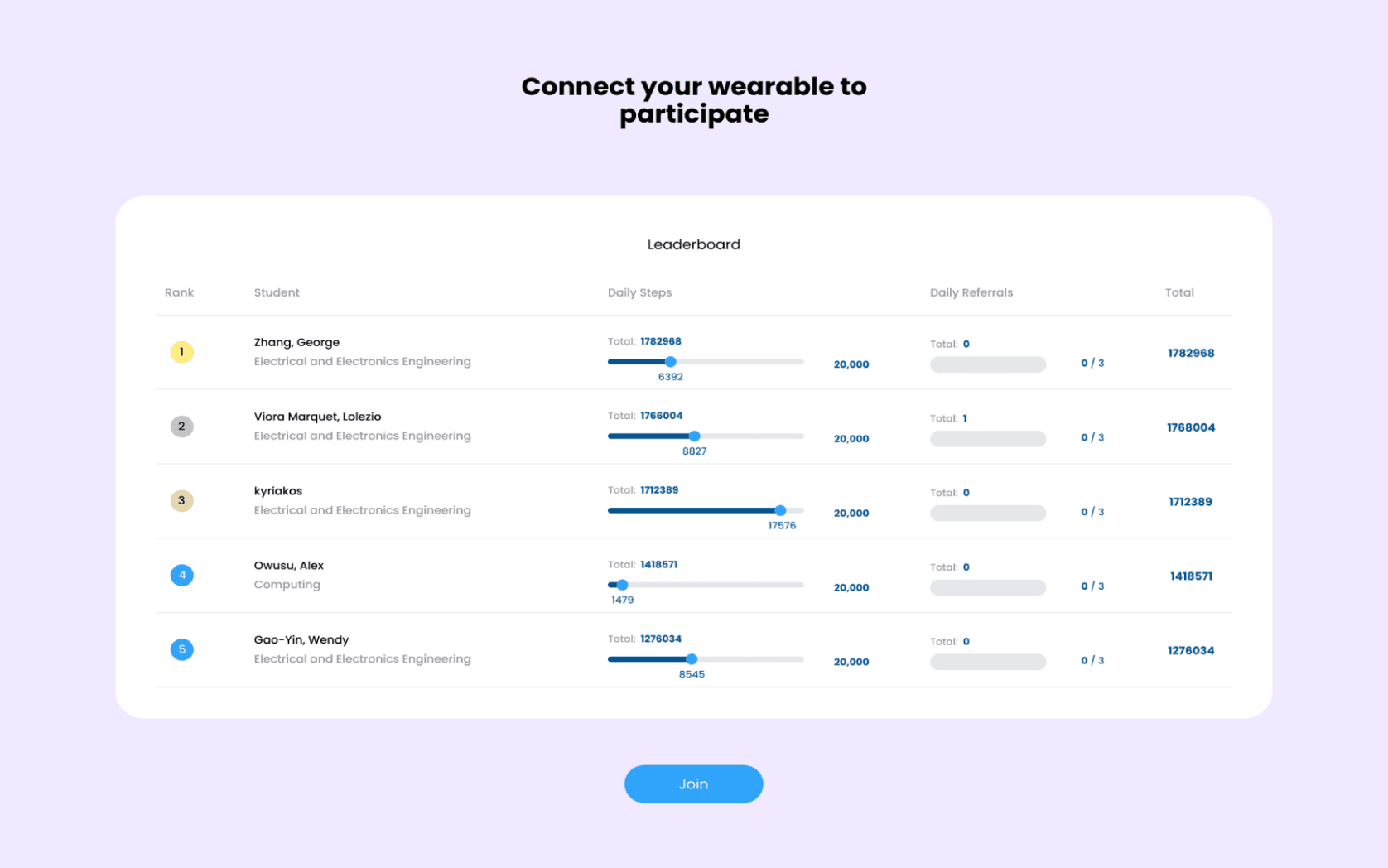
The old design had 4 columns worth of content, name, number of steps, number of referrals, and total scores.
To add more white space and minimize clutter I removed the number or referrals column and added a '0/3' next to the user's names to represent referrals, when users hover over it a short description of what its used for will appear.
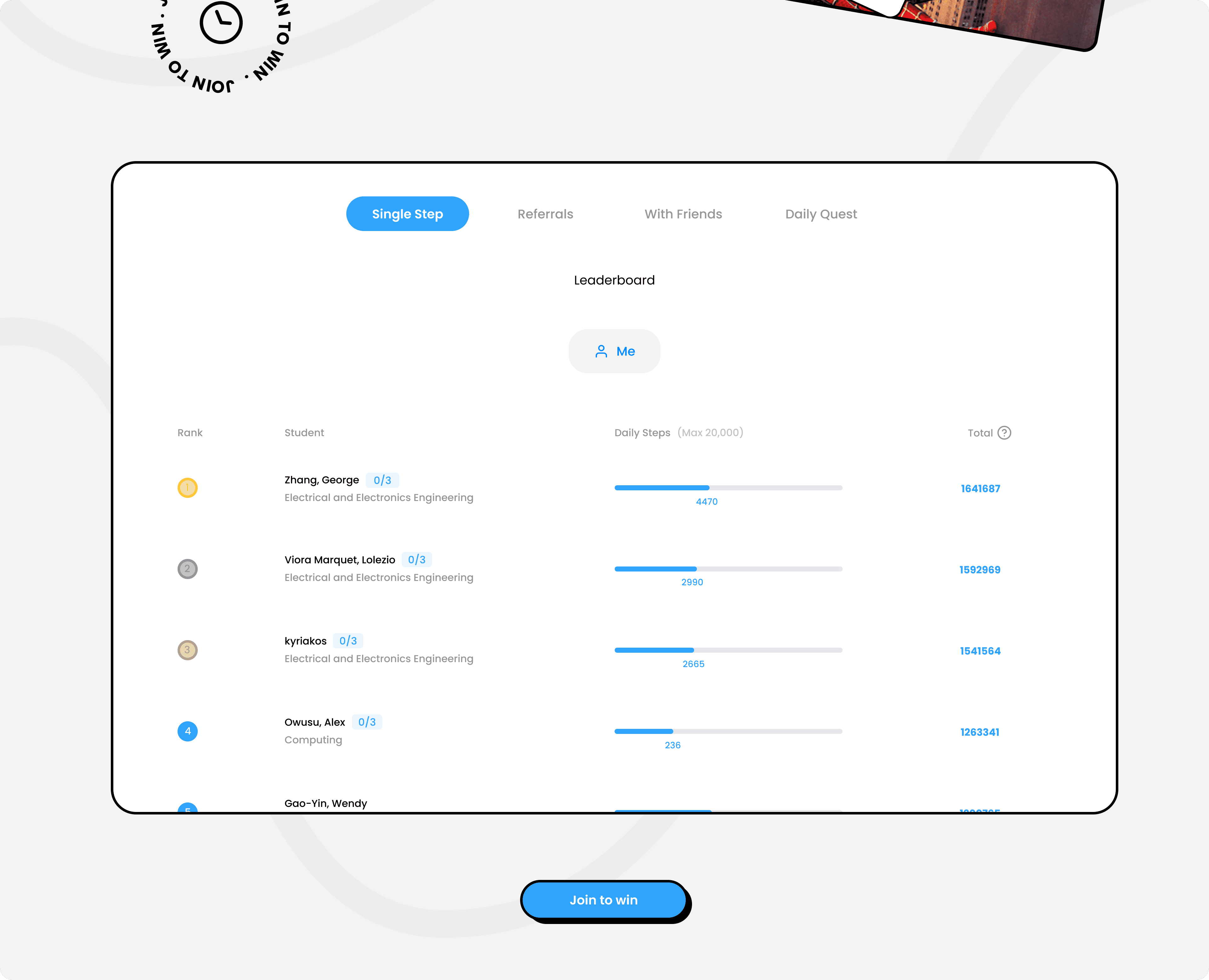
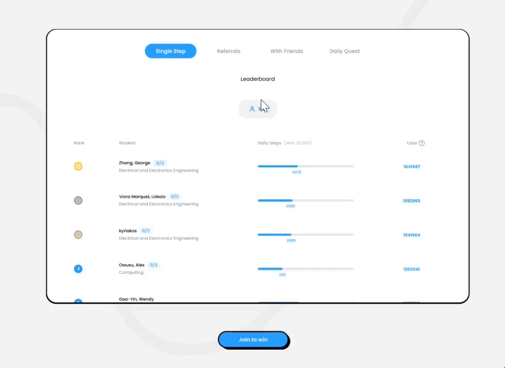
Click to scroll
Click to scroll
Instead of users having to scroll through the list of participants to find their name or team, simply click a button to find where they are on the leaderboard
Instead of users having to scroll through the list of participants to find their name or team, simply click a button to find where they are on the leaderboard
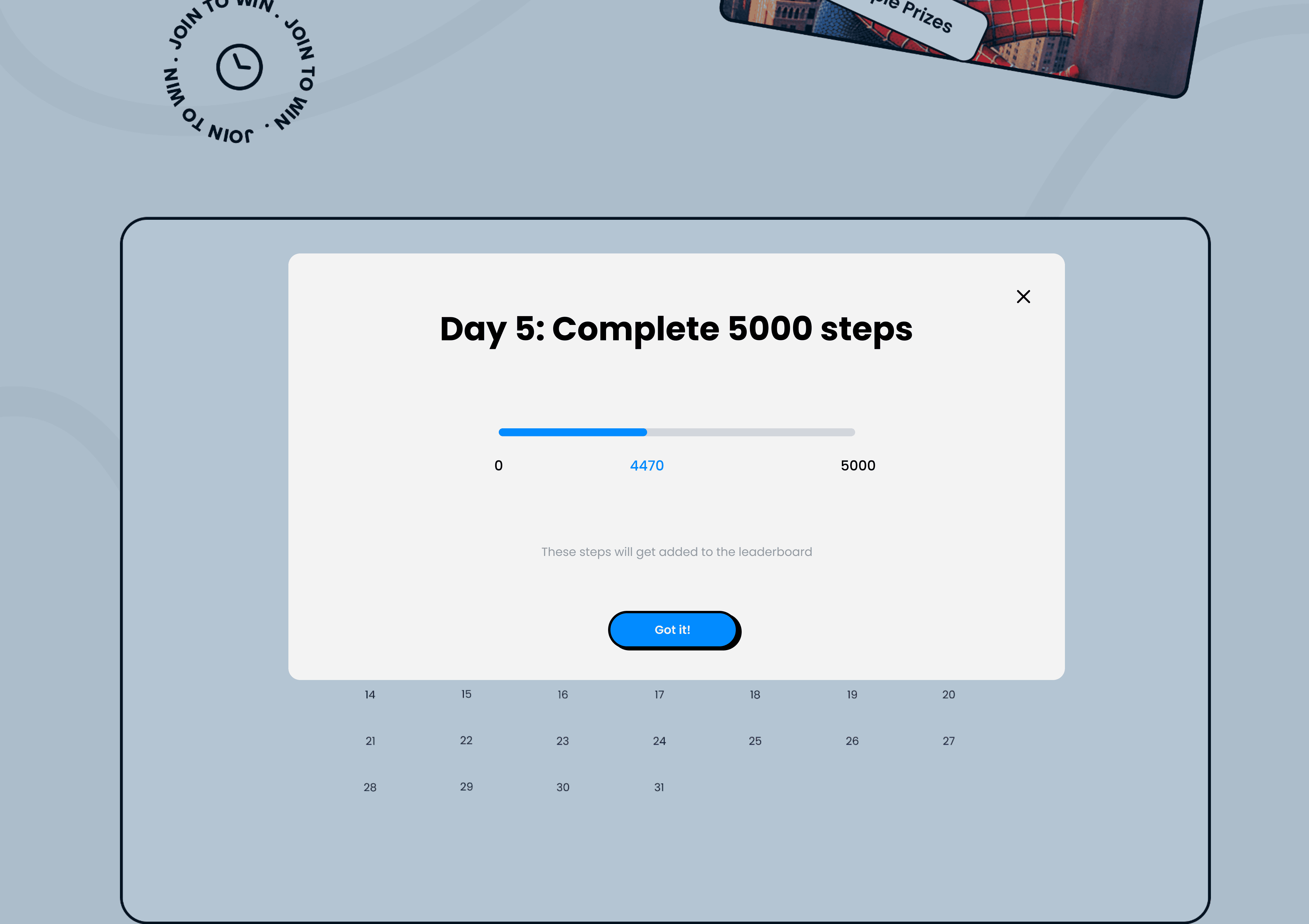
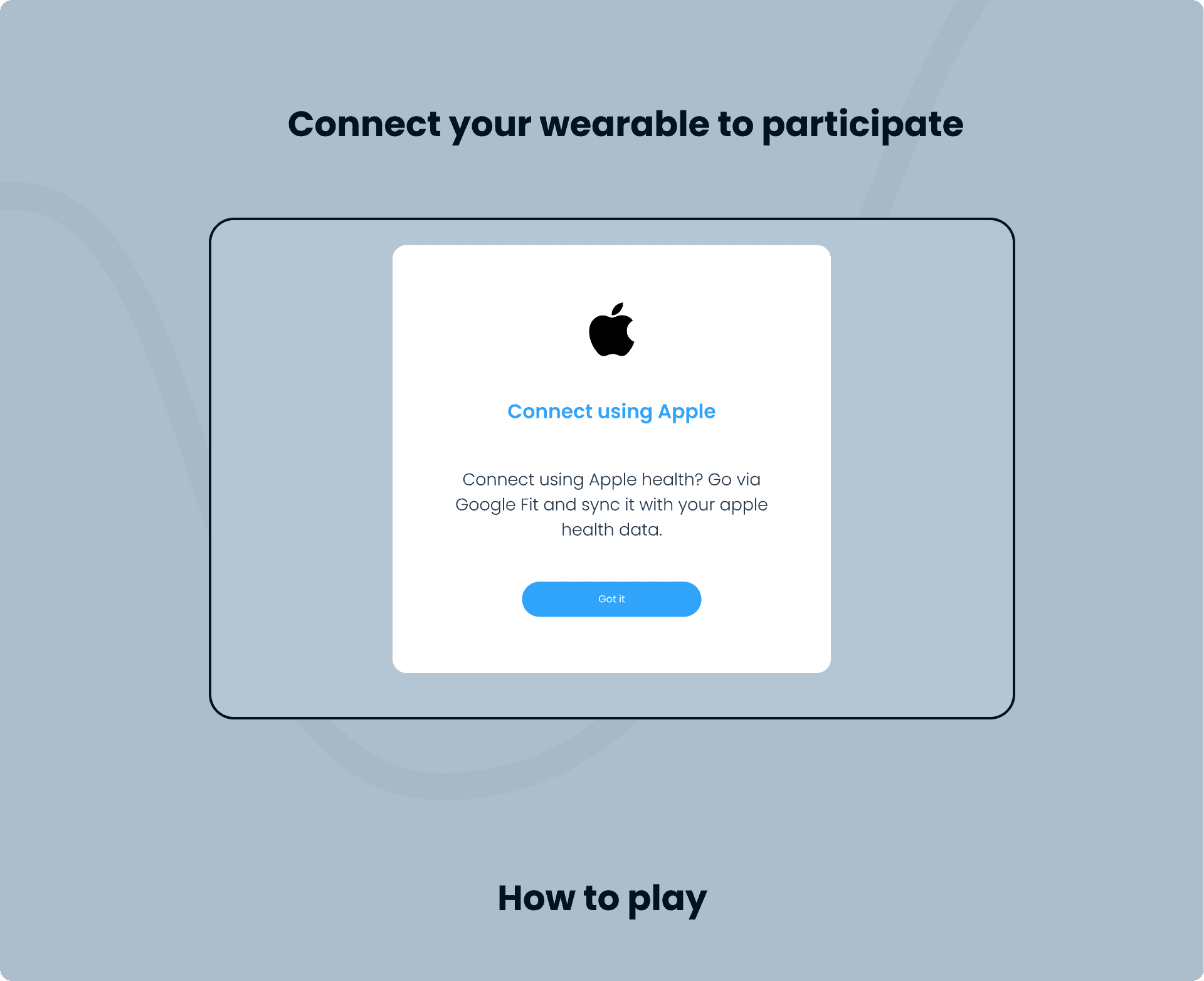
Connecting to Apple devices
Connecting to Apple devices
Throughout the challenge, we found that students had difficulties connecting their devices to our API, particularly using Apple devices.
To address this issue, we implemented a pop-up modal, highlighting that participants with iOS devices need to download Google Fit to join the challenge.
Throughout the challenge, we found that students had difficulties connecting their devices to our API, particularly using Apple devices.
To address this issue, we implemented a pop-up modal, highlighting that participants with iOS devices need to download Google Fit to join the challenge.
Visual design
Visual design
Remember, we're targeting students!
Remember, we're targeting students!
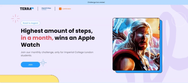
When I was diving into the visual design, the goal was to give the site a bit of a fun and quirky personality whilst keeping things simple.
When I was diving into the visual design, the goal was to give the site a bit of a fun and quirky personality whilst keeping things simple.
Final design
Final design
Layout
Layout
I decided to keep the over structure of the site the same as the previous to help cut down development time.
I decided to keep the over structure of the site the same as the previous to help cut down development time.

All in one!
All in one!
Due to time constraint we felt that it would be efficient to keep everything on one page allowing users to switch between sections.
Due to time constraint we felt that it would be efficient to keep everything on one page allowing users to switch between sections.


IMPACT
IMPACT
✳ 200+ students signed up and actively participated in the challenge. Which was a 50% increase in compared to the previous year.
✳ 200+ students signed up and actively participated in the challenge. Which was a 50% increase in compared to the previous year.
Next time
Next time
Testing
Testing
Due to time constraints I felt rushed when pushing the design to development, I would have liked to have done some testing to see what else I could have done.
Due to time constraints I felt rushed when pushing the design to development, I would have liked to have done some testing to see what else I could have done.
Documentation
Documentation
I was not able to create any documentation to hand over to developers, this led to a lot of confusion and back and forth discussion, increasing development time.
I was not able to create any documentation to hand over to developers, this led to a lot of confusion and back and forth discussion, increasing development time.
© 2025 by Caroline Sia Made with ❤️🍵
© 2025 by Caroline Sia Made with ❤️🍵
© 2025 by Caroline Sia Made with ❤️🍵
