© 2023 by Caroline Sia Made with ❤️🍵
Simplifying the grocery shopping experience for all
Designing for apps
Side project
WHat’s foundit?
Foundit is a scanning application that aims to improve users’ shopping experience by simplifying information from groceries items, arranging them in a way that is easy for users to browse and obtain the necessary information as efficiently as possible.
My role / tasks
Sole designer, user research, usability testing, user interviews, wireframing, Hi-fi & low-fi prototyping, UI design, concept ideation
Duration
1 Month
Tools
Notion, Figma, Miro, Maze, Google Survey, Zoom
Identifying the problem
During trips to the grocery store with my mum, she would hand me food products, and ask me; "when does it expire?", "Does it have cheese?", "How much is in it?". I find that she has a less pleasant shopping experience without me as she spends more time trying to reading information on packaging. This got me thinking... what if my mum isn’t the only person having a hard time reading food labels?
58% of the online consumer panel identified the “size of the text” on food labels as making them hard to read or interpret
Food Standards Agency (FSA)
I speculated that only a small amount of people would experience difficulty in reading information but the number was much higher than I expected. This sparked my curiosity even more, and I wanted to see what the users had to say.
More in-depth research
Conducted a total or 2 user interviews and 12 surveys, the goal was to discover difficulties users encounter when looking for information on food labels
In the end we found 3 common themes!
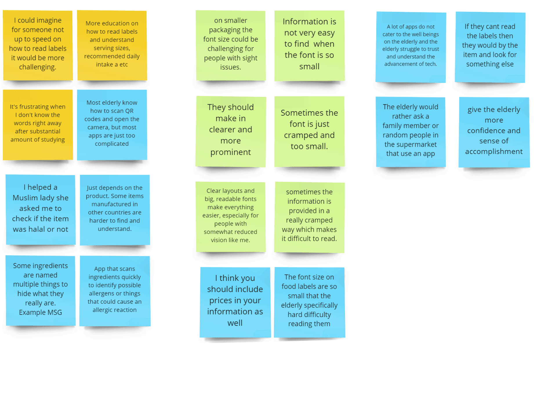
Themes
Inconsistent wording
"MSG" for example is referred to by other names on different food labels, such as "hydrolysed vegetable protein" or "yeast extract"
Unreadable content
Due to the small font size and cramped layout, users find it hard to find information, it is especially challenging for those who have reduced vision, or visual impairments
Terminology
The terms "emulsifiers" and "dietary fiber" are not commonly known or understood by the average user.
Lets look at competitors!
In my search for apps with similar concepts, I did not find any direct competitors, however I did identify three indirect competitors that have a similar concept. To conduct this analysis, I first established my main objectives and outlined how each would be evaluated.
WHat i learnt
Offer the option to input allergies and dietary restrictions during onboarding.
While the text size is already appropriate for reading, there is currently no feature that allows users to adjust the size of the text to their liking.
The most popular method for obtaining product information is by scanning the barcode.
The structure of information organization in my app needs to be more elaborate. Because my app will have to handle more information than just nutritional data, unlike my competitors.
m
o
r
e
r
e
s
e
a
r
c
h
i
s
n
e
e
d
e
d
•
m
o
r
e
r
e
s
e
a
r
c
h
i
s
n
e
e
d
e
d
•
Problem statement
How might we increase users' understanding of nutritional terminologies?
How might we ensure that text size is easily adjustable for all ages?
How might we organize information from food labels on the app?
Time to sketch!

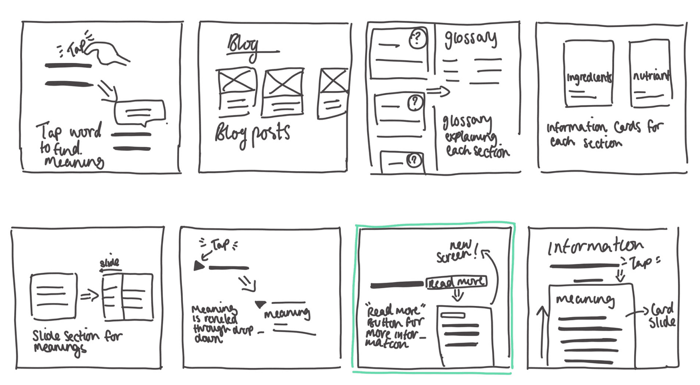

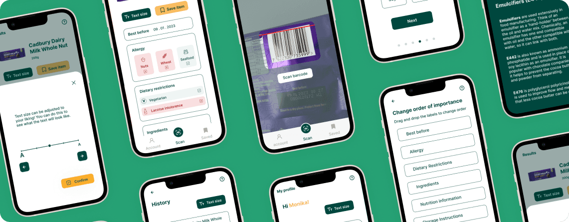
Scan barcode

Scan
account
Items
Welcome
Effortlessly scan any food item with [app name] for information that is simplified, enlarged and easy to read!
Start
Next
Name
Next
Name
Monika
Next
Country of residence
Next
Country of residence
United Kingdom
Next
Allergy
Peanuts
Wheat
Eggs
Soya
Seafood
Sulphites
Next
Dietary restrictions
Lacotse intolorence
Vegiterian
Kosher
Vegan
Gluten free
Halal
Select Allergy
Confirm
A
A
Peanuts
Eggs
Sulphites
Wheat
Seafood
Soy
Scan
account
Items
Select Dietary restrictions
Confirm
Vegiterian
Kosher
Vegan
Gluten free
Halal
A
A
Lacotse intolorence
Scan
account
Items
Allergy
Allergy 1
Allergy 2
Allergy 3
Hi Monika!
Settings
Change
A
A
Text size
Dietary restrctions
Restriction 1
Restriction 1
Change
Label order
Best before
Dietary Restrictions
Allergies
Ingredients
Nutrition information
Storage Instructions
Change Order
My profile
Scan
account
Items
My profile
Dietary restrctions
Restriction 1
Restriction 1
Change
Hi Monika!
Settings
Allergy
Allergy 1
Allergy 2
Allergy 3
Change
A
A
Text size
Label order
Best before
Dietary Restrictions
Allergies
Ingredients
Nutrition information
Storage Instructions
Change Order
Scan
account
Items
Items
History
Saved
Cadbury Dairy Milk Whole Nut Chocolate Bar
Kellogg's Coco Pops
200g
720g
Scan
account
Items
Items
History
Saved
Cadbury Dairy Milk Whole Nut Chocolate Bar
Kellogg's Coco Pops
KTC Coconut Milk
200g
720g
400g
Scan
account
Items
Allergy
Allergy 1
Allergy 2
Allergy 3
A
A
Dietary restrctions
Restriction 1
Restriction 2
A
A
Ingredients
Milk
Cocoa Butter
Roasted hazelnuts
Veg fat (Shea, palm)
Emulcifiers (E442,E476)
Read more
Read more
Read more
Read more
A
A
Nutrition information
Energy
2000 kcal
70g
20g
260g
90g
-
50g
6g
Fat
Of which saturates
Carbahydrates
Of which sugars
Fibre
Protien
Fat
Read more
Read more
Read more
Read more
Read more
Read more
Read more
Read more
A
A
Storage Instructions
Store in a dry place, protect from heat
A
A
How to prepare
-
A
A
Best before
09 . 01 . 2023
A
A
Product name
200g
Save item
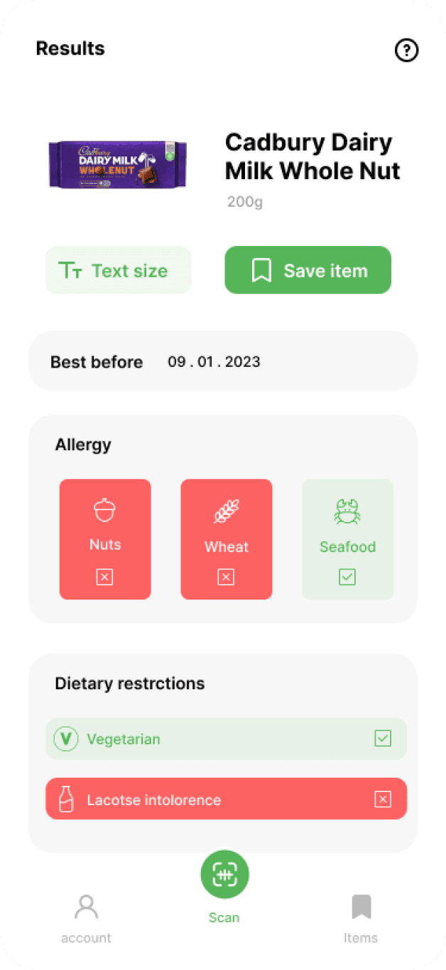
Results
Scan
account
Items
Allergy
Allergy 1
Allergy 2
Allergy 3
A
A
Dietary restrctions
Restriction 1
Restriction 2
A
A
Ingredients
Milk
Cocoa Butter
Roasted hazelnuts
Veg fat (Shea, palm)
Emulcifiers (E442,E476)
Read more
Read more
Read more
Read more
A
A
Nutrition information
Energy
2000 kcal
70g
20g
260g
90g
-
50g
6g
Fat
Of which saturates
Carbahydrates
Of which sugars
Fibre
Protien
Fat
Read more
Read more
Read more
Read more
Read more
Read more
Read more
Read more
A
A
Storage Instructions
Store in a dry place, protect from heat
A
A
How to prepare
-
A
A
Best before
09 . 01 . 2023
A
A
Product name
200g
Save item
Results
Scan
account
Items
Change category order
Scan
account
Items
Confirm
Best before
Dietary Restrictions
Allergies
Ingredients
Storage Instructions
Drag and drop the labels to change order
A
A
Nutrition information
Change category order
Scan
account
Items
Confirm
Best before
Allergy
Ingredients
Storage Instructions
Drag and drop the labels to change order
Dietary Restrictions
A
A
Nutrition information
Results
Allergy
Allergy 1
Allergy 2
Allergy 3
Dietary restrctions
Restriction 1
Restriction 2
Ingredients
Milk
Cocoa Butter
Roasted hazelnuts
Veg fat (Shea, palm)
Emulcifiers (E442,E476)
Read more
Read more
Read more
Read more
Nutrition information
Energy
2000 kcal
70g
20g
260g
90g
-
50g
6g
Fat
Of which saturates
Carbahydrates
Of which sugars
Fibre
Protien
Fat
Read more
Read more
Read more
Read more
Read more
Read more
Read more
Read more
Storage Instructions
Store in a dry place, protect from heat
How to prepare
-
Best before
09 . 01 . 2023
Product name
200g
Save item
Text size
A
Scan
account
Items
My profile
Hi Monika!
Settings
Allergy
Allergy 1
Allergy 2
Allergy 3
Change
A
A
Text size
Dietary restrctions
Restriction 1
Restriction 1
Change
Label order
Best before
Dietary Restrictions
Allergies
Ingredients
Nutrition information
Storage Instructions
Change Order
Scan history
Scan
account
Items
Usability Testing
Once I created the low-fidelity prototype, I conducted a usability test. I found that there were two main changes I needed to make
Feedback #1
While the light drop shadow added some depth between the components, some users still had difficulty distinguishing between the background from the groups of information. To address this I added boarders to create contrast between the background and the foreground.
Iteration 1
Iteration 2
Iteration 3


Feedback #2
Users explained that although having the ability to change text size is useful, having it on the profile page makes it less accessible, especially if you are out shopping and need to do a quick change.
Iteration 1
Iteration 2


Iteration 3
Main flows
personalised Onboarding
They are then asked a series of simple questions relating to their allergies and dietary requirements.
They are then asked to order the categories to their liking.
This personalizes the information based on the needs if its individual user.


Everything on one screen
Once the scanning is successful the user is automatically taken to the results page which contains food label information.
Features like text size and read more are also available here.
edit personal details
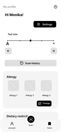
To change allergies, dietary restrictions, and label order users can go to the ‘My Profile’ page.
This screen will also show what their current settings are.

Take away
Impact
I conducted one more usability test to see what my users think of the final design.
Overall over 80% of users were able to easily complete all 3 tasks that were set!
Task 3 (which was to change the category order) was the least successful with an 82% success rate. After asking users what they found difficult, they said that they expected to be able to change category orders on the results page by dragging and dropping, the current can be a hassle.
NEXT TIME
Personalization
I would consider adding different colour palettes, which would allow for more personalization as they can choose a colour palette they find clearer than the default. Maybe even considering custom colour palettes for users with specific visual impairments?
Inclusivity for our elderly users
To increase inclusivity in the app, whether users are able to scan items using the app with ease will definitely need to be considered, this is especially true for users who are elderly and may suffer from reduced fine-motor control and slower response times.
learnings
There is a reason for everything
I learned that everything within your design must have a reason. Although what I did may have looked good it did not necessarily fit the user’s needs, this in my mind ultimately led to a better design.
Considering impact
This project was a turning point for me when it came to considering the impact of my designs. I was introduced to KPIs, and although I only used one in this project, it opened my eyes to the value of using KPIs to measure the success of a design.
