
Problem
How might we introduce the new release cycle to users in a way that's digestible?
As the R&D team are working on larger features, the current 3-weekly release notes mean that the team do not have enough time to work on larger features.
I worked with the product team to come up with a solution. That allowed clients to onboard to this new cycle and showcase different release notes.
Release notes before redesign
Iteration
New module?
We proposed an entirely new module for the release notes so as not to overwhelm users who are on the home page. Users can access the module through banners when there is an update with the release or in the menu.


Screens from inital concept
Iteration
Changing home page from single
screen to a 2 tab approach
Even with additional sections like upcoming events and a coming soon section for users to see before the full release, it still seems like adding a new module didn't solve the problem. This project was in line with the Homepage design project.
However, with the introduction of the 2-tab home page, it opens up many more possibilities to simplify this entire flow, eliminating most screens from the initial flow we proposed, so much so that we didn’t see much value in keeping the beta module.

Solution
Dividing the design into 3 main user flows
Onboarding
For out initial rolled of the new cycle and for new clients
Regular users
Users who would like to only recieve the main release that comes out every quater
Preview users
Users who opt-in for early releases that comes out very 3 weeks they'll receive updates and features before the main release
Then created a mid-fidelity prototype was created, the aim was to establish the copy and the flow before trying to add polish. This design went through many rounds of iterations.
Onboarding clients made easy
Users can now choose to stay in their current cycle or switch. To minimise hesitation during this stage, we paid extra attention to ensuring the language used isn't intimidating.
It addresses possible questions they may have, such as 'why is this happening' and 'how does it affect me'.
The onboarding page can be found within the settings pagin if users ever want to switch back
Onboarding for clients during initial roll out of the new cycle
Regular users
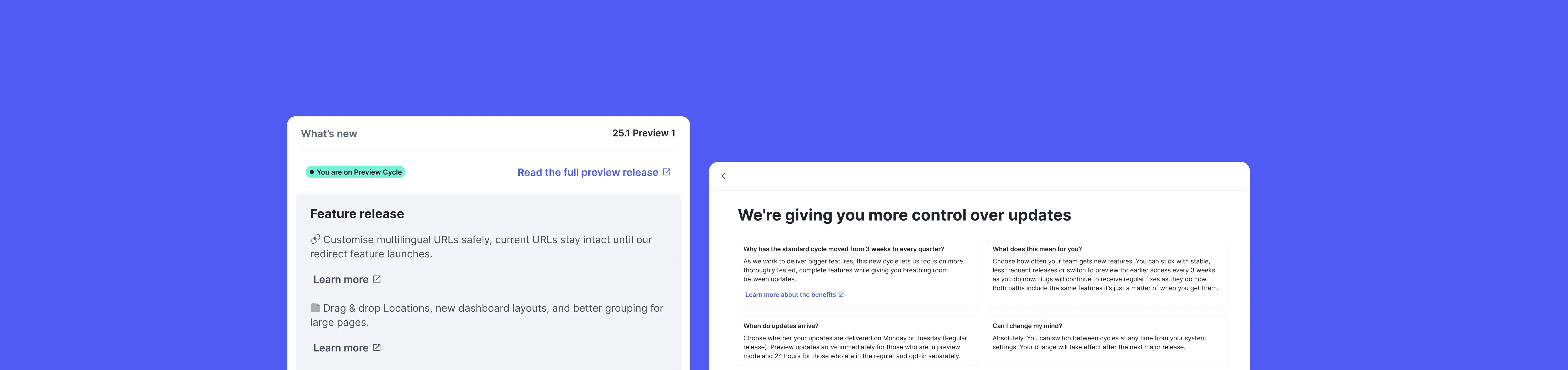
Regular users will receive the full release notes at the end of every quarter. Some clients expressed that they would like to know what's in the upcoming release beforehand to ensure the update won't affect their workflow. Based on that request, they'll get a sneak peek of what's coming up 2 weeks before the full release is out

Main release for regular users, they'll also receive a call out about new preview release and the check it out in settings
2 weeks before the main release for regular users

Regular users can have a sneak peak of the preview releases in settings, this is when they're most likely to want to switch preview mode
Preview users
Preview users will get mini release notes every 3 weeks, which build towards the full release notes. Users will have access to new updates sooner as a way to help us test new features and changes before we roll them out to the wider public at the end of the quarter.

Darkmode


Preparing Handoff to development
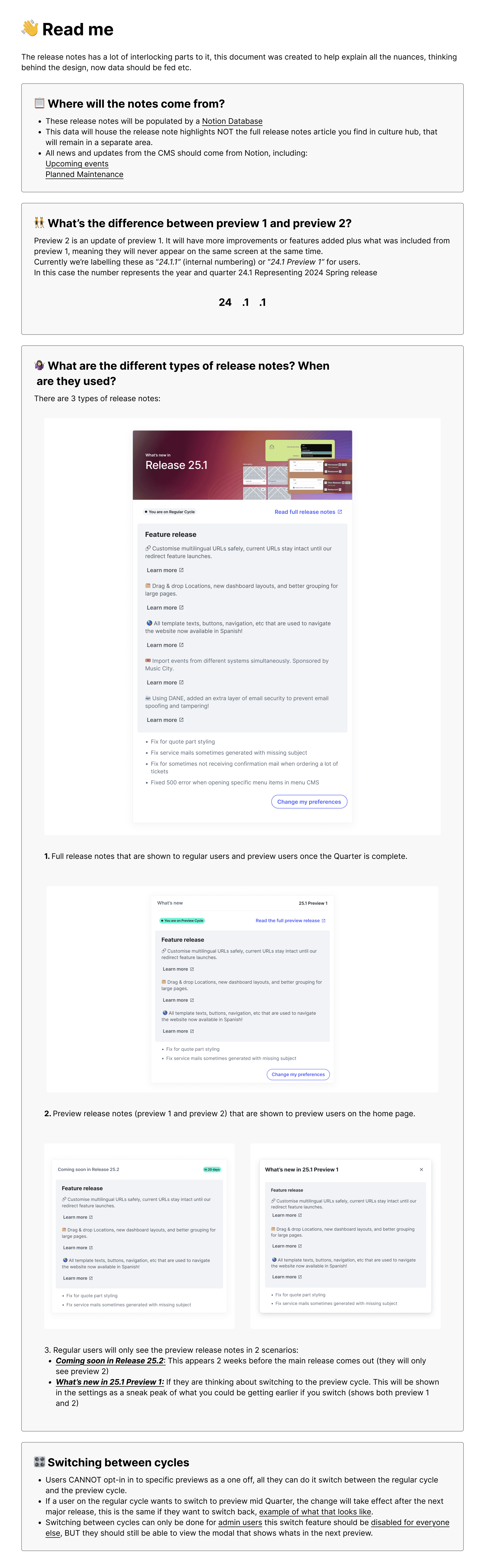
To ensure seamless handover, we wrote a quick doc to help explain all the nuances and ambiguity behind the design, touching upon several factors:
Where data will come from (linking to data bases)
the difference between preview 1 and preview 2
Different type of release notes, and when they should be surfaces and for which type of user?
When users switch between cycles?
Our devs specifically arent a fan of figma and dont like the idea of being able to see mulitple screens at the same time, so having a protoype followed by adding some comments was the best solution

IMPACT
100%
Found the on boarding process to be seemless and an the release notes to be an improvement
25%
Increase in users going to the full release notes from the dashboard
93%
Users completed onboarding with little to no friction
I learned
Inviting copy makes all the difference
As this is a new feature, making sure to include empty states in your designs are crucial. It was something I almost neglected doing if it weren't for creating the new users flow.
Scrapping designs for a better solution is ok
Although we had initally design an entire new module for the release notes, it never felt right. After introducing the 2 tab format, we scrapped those designs for something better!